Artistic Amplify
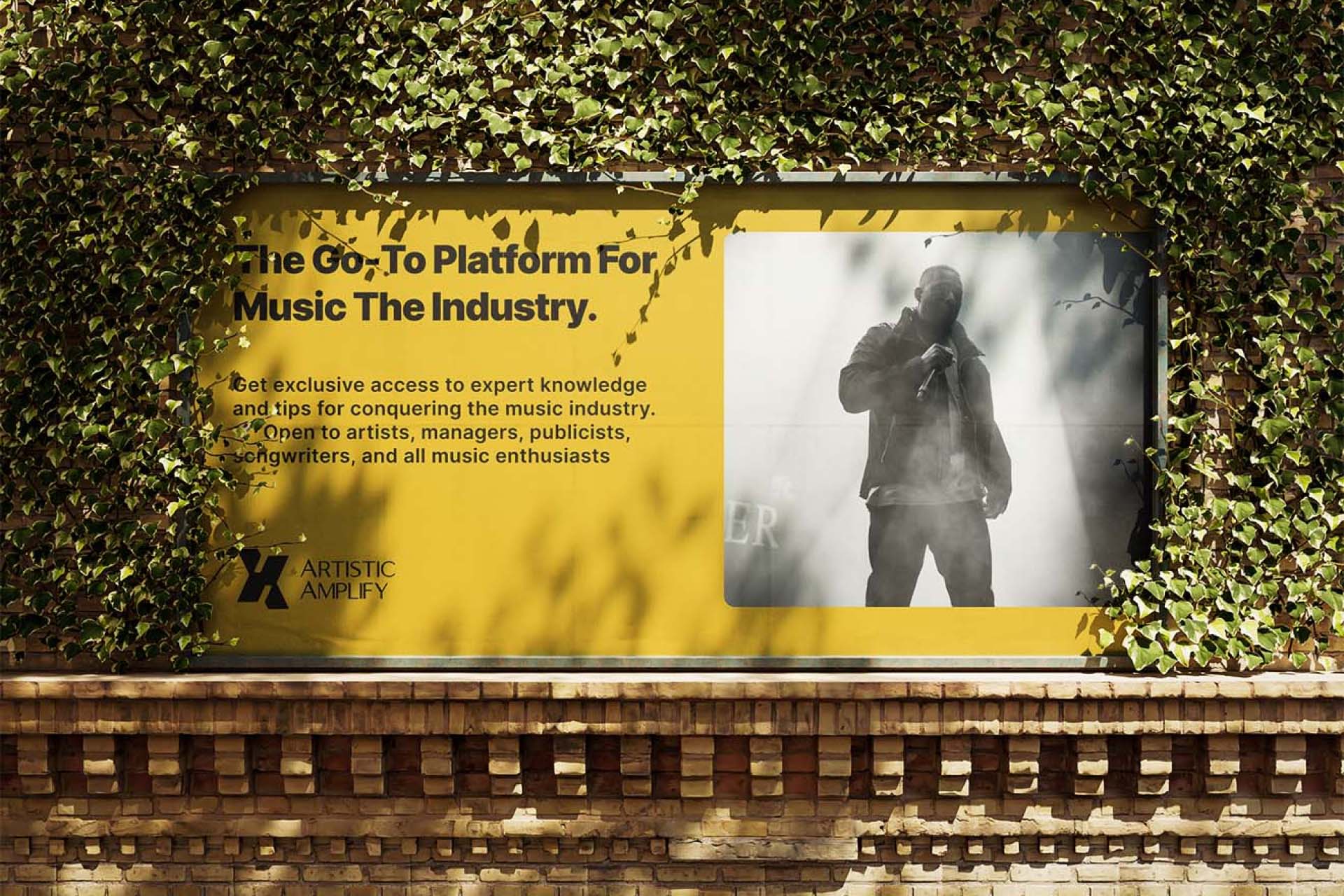
We were task by an old friend to create a brand identity for his new project titled Artistic Amplify. They are on mission to empower aspiring artists by providing them with the tools, resources, and guidance necessary to succeed in the music industry.
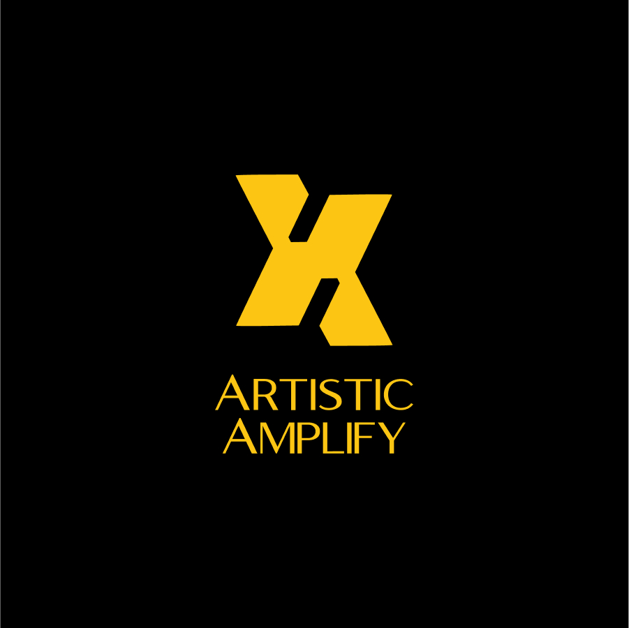
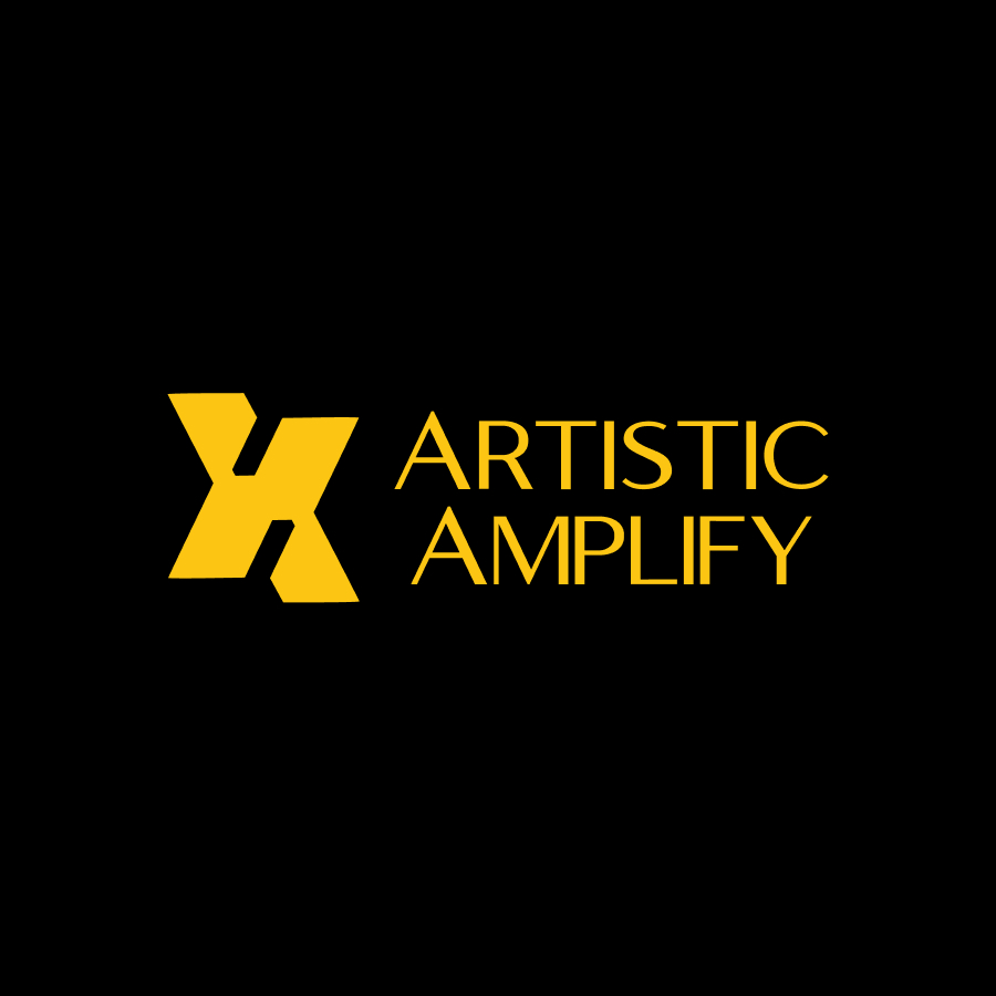
We brought this out in a clever and minimalist design that effectively represents the brand’s identity and purpose. The icon is composed of two stylized “A” letters from the brand name, ingeniously combined to create a shape that resembles an “X” symbolizing a meeting point or intersection. This visual metaphor elegantly conveys the platform’s role in bringing together different creative individuals, fostering collaboration and connection.
The lower part of the icon, formed by one of the “A”s, subtly evokes the image of a house. This symbolism is intentional, representing the community aspect of the platform and suggesting a welcoming space or “home” for creatives to gather.
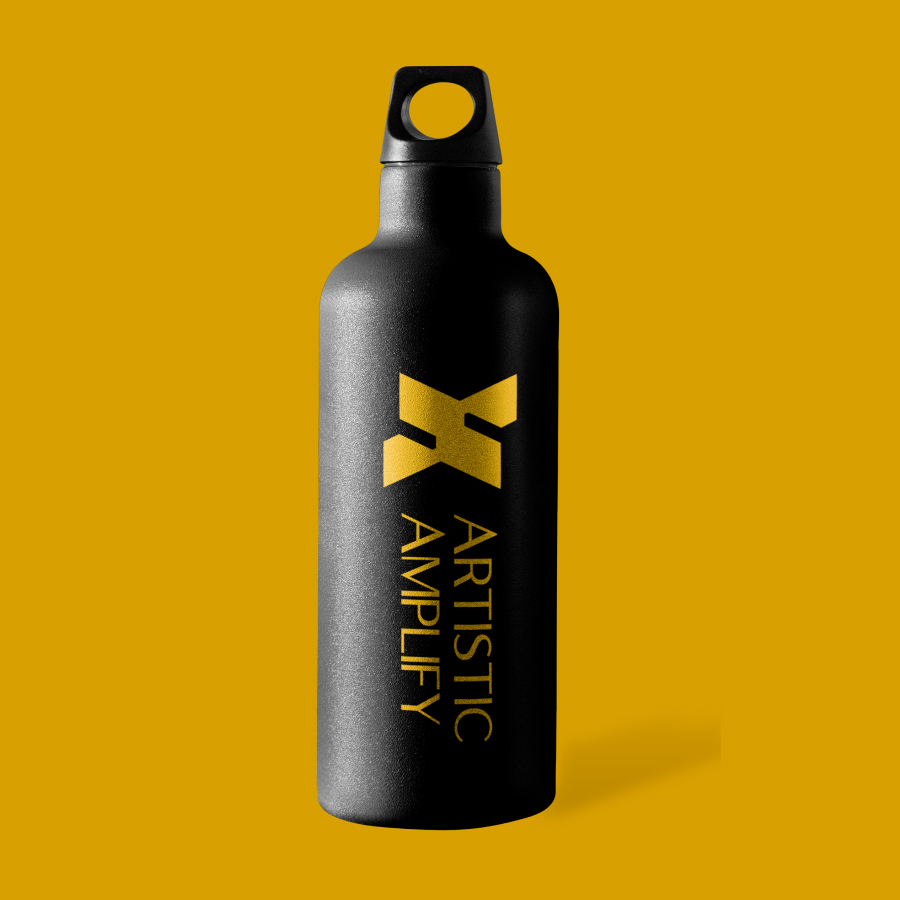
We intentionally used a color scheme that is striking and impactful, using a vibrant yellow (color code #D8A000) against a black background. This high-contrast combination ensures the logo is visually arresting and memorable. The yellow color often associated with creativity, energy, and optimism, aligns well with the brand’s focus on artistic expression and community.
The logotype is in all capitals, created using a clean, modern sans-serif font. This typography choice complements the geometric nature of the icon while ensuring clear legibility.
The overall design successfully balances simplicity with rich symbolism, creating a logo that is both visually appealing and meaningful in its representation of the brand’s core values and purpose.